

Hi there, I’m Andrei Marius, a Senior UI/UX and Product Designer with a strong background in visual design, illustration, and educational content. For over 15 years, I’ve been creating cross-platform experiences for Mac, iPad, iPhone, and web products, helping turn complex tools into intuitive user experiences.
Alongside product design, I’ve published 500+ written and video tutorials, reaching millions of designers worldwide. My work sits at the intersection of usability, visual craft, and education.
Origin Story 💥
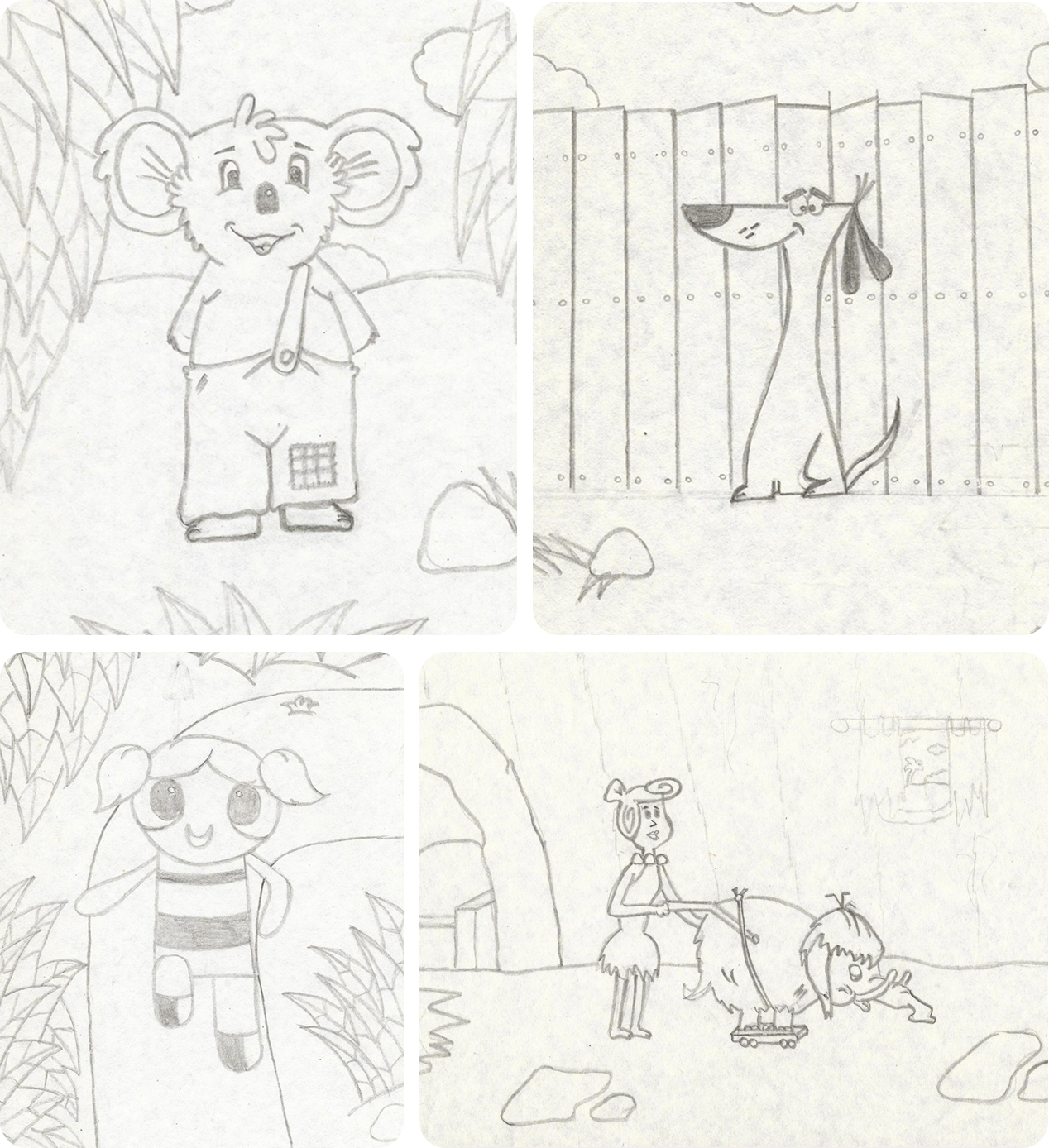
Like many ’90s kids, my creative journey started with doodling my favorite cartoon characters. My first real “aha” moment came when I was eight, stuck at home with the mumps for a couple of weeks. Just me, nonstop cartoon re-runs, a stack of paper, and a handful of pencils. After plenty of failed attempts, I finally nailed my first decent cartoon drawing: Blinky Bill.
That small win sparked something. I kept sketching, experimenting, and slowly building a collection of drawings without ever seriously thinking it could become a career. Along the way, I explored different mediums — from ink to oil painting — before realizing my real passion wasn’t traditional art itself, but the endless creative possibilities of digital design.

Beginnings 🚀
My journey into digital design began in my first year of college, when curiosity led me to explore HTML and CSS before gradually moving into tools like Photoshop, Illustrator, Flash, InDesign, CorelDRAW, and even a bit of 3D modeling. Each one taught me something different, but Illustrator was the one that truly clicked.
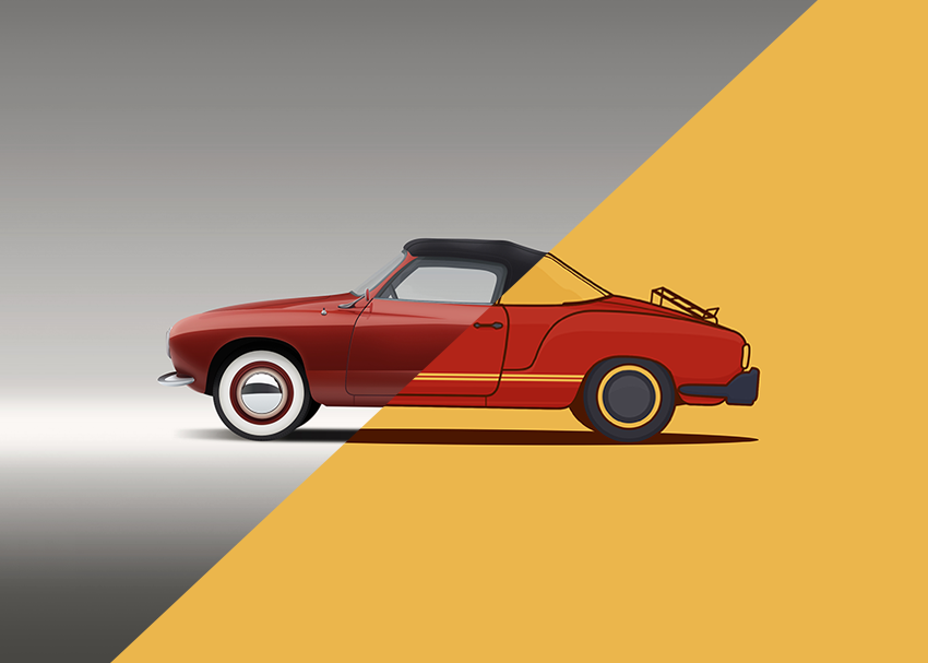
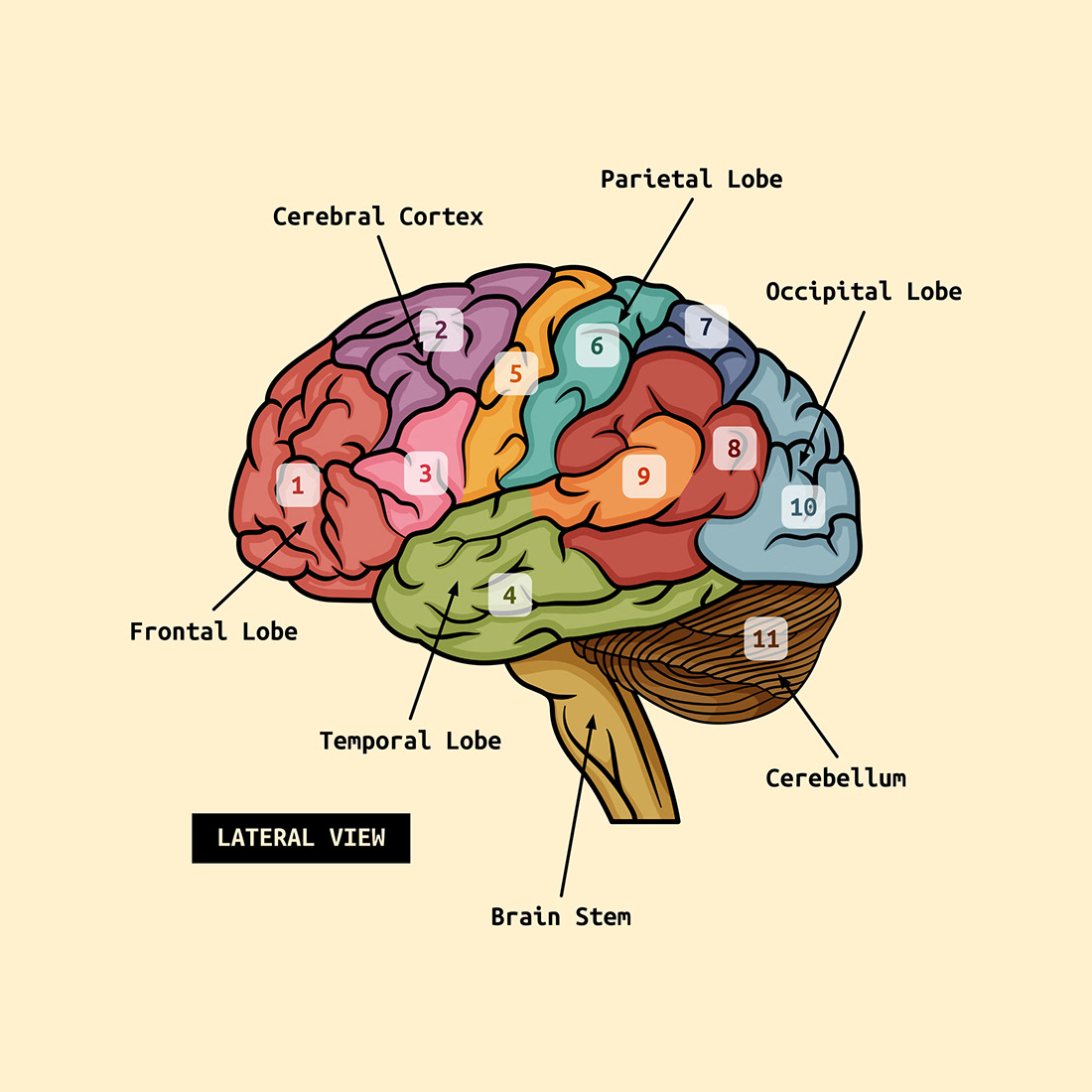
After about a year of experimenting and refining my skills, I published my first tutorial on Envato Tuts+: How to Create a Realistic Vector Building Illustration — a milestone that marked the beginning of something much bigger than I had imagined.
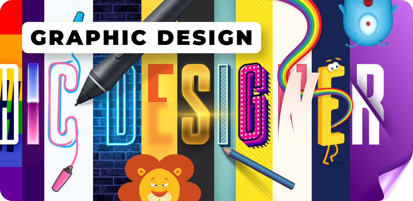
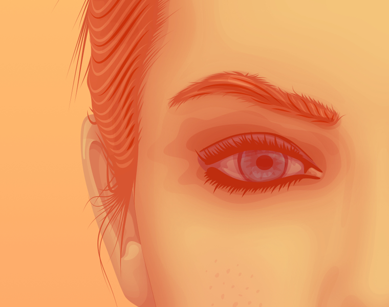
Over the next decade, that first tutorial grew into a library of more than 500 educational pieces, spanning vector illustration, icon design, text effects, branding, UI design, motion graphics, and visual storytelling. Working across tools like Illustrator, Photoshop, After Effects, Figma, Sketch, XD, Affinity Designer, and Graphic, I developed not only a broad creative toolkit, but also a deep appreciation for clarity, structure, and making complex ideas easier to understand.


Collaborations 🤝
In 2014, I started collaborating with Autodesk Graphic (now Picta Graphic), helping shape the UI/UX of its vector design app across Mac, iPad, and iPhone. My focus was on simplifying complex workflows, improving interface consistency, and creating a more intuitive product experience that felt cohesive across devices.
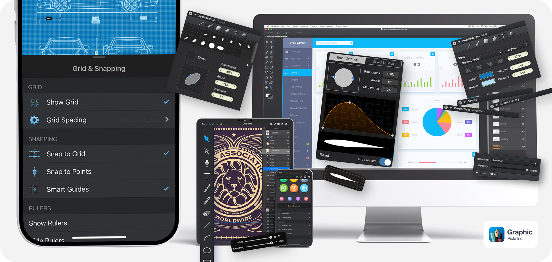
Redesigned the entire Graphic website (graphic.com) from the ground up, improving navigation, visual consistency, and product storytelling across key landing pages. In parallel, I developed a comprehensive user guide for the Mac, iPad, and iPhone versions—helping align documentation with real user needs and evolving product features.
Also worked on design projects, tutorials, animations, and short videos to promote the app and showcase its capabilities, which sparked my interest in video production.


Expanding into Video ▶
Alongside written tutorials, I expanded into video as a natural extension of educational content—using motion, pacing, voiceover, and visual storytelling to make complex design concepts easier to follow in real time.
This shift allowed me to deepen my skills in Adobe After Effects, editing, motion graphics, and video production, while exploring new ways to communicate product workflows and creative techniques more clearly.
It’s been a fun way to give back to the design community, while also sharpening my own skills along the way.
UI/UX Design Transition 💡
Beginning in 2014, my collaboration with the Graphic app team deepened my focus on UI/UX and product design, contributing to interface improvements and cross-platform consistency across Mac, iPad, and iPhone.
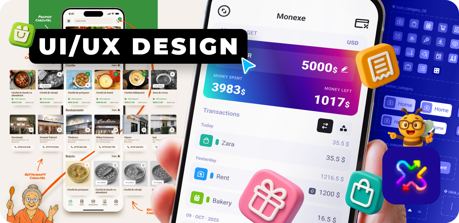
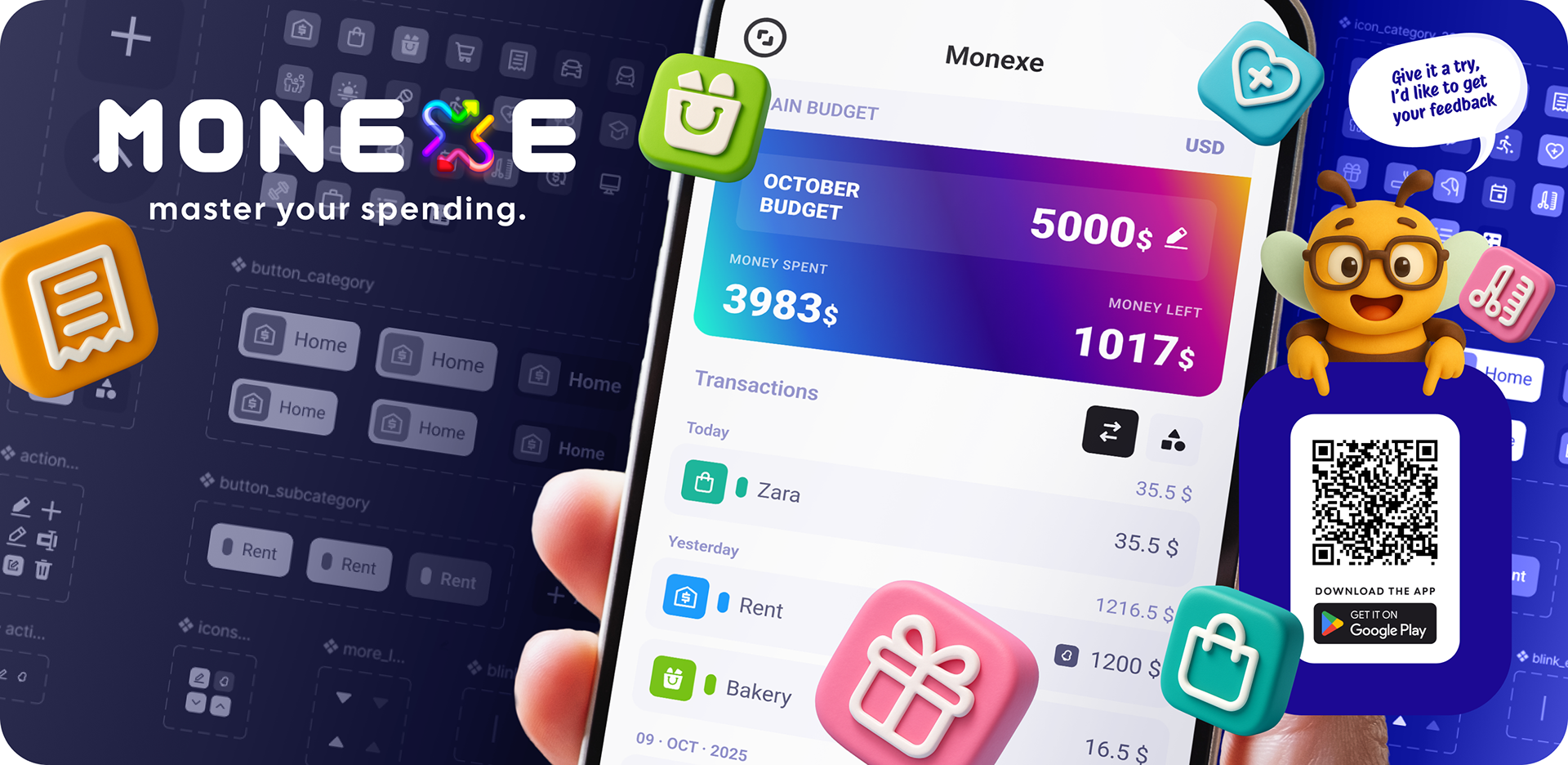
This evolution eventually led to Monexe, a money management app I designed to help people track expenses, set budgets, and take control of their finances. From interface design and interaction flows to onboarding and tutorials, Monexe brought together my experience in product thinking, usability, and communication into a single end-to-end product.
Bringing it to life marked an important step in my journey—not just as a designer of interfaces, but as a designer of complete user experiences.
Today, I enjoy working on products where design, storytelling, and user experience meet, especially tools that empower people to create, understand, and work more effectively.

If you’ve got any questions, feedback, or want to work together, feel free to email me at: